The Barbie logo has played a big role in the brand’s success, giving it a fun and playful feel that appeals to all ages. Its kid-friendly font adds to its charm, making it a favorite for many.
With so many Barbie logo styles available—transparent, silhouette, clipart, wallpaper, and vector formats—it suits almost every need, including those who love black fonts!
In this article, I will take you through the history of the Barbie logo, how it has changed over the years, and the fonts used for both the Barbie and Mattel logos. Let’s get started!
The Barbie Logo History – 1959 To Present
The Barbie logo has undergone a few changes over the years. However, it has always retained certain aspects, ensuring its continuity and keeping the signature brand fresh.
The Barbie logo history is also a testament that sticking to your roots can take you far. On that note, take a look at Barbie logos over the years:-
1. The Original – 1959 To 1975

The first Barbie logo, introduced in 1959, featured a pink cursive font. It was distinct and memorable, and that’s why I stayed with the company for over 15 years.
Regarding the font, the first letter is slightly lower than the rest of the words. In fact, the height of all the letters (both top and bottom) was not uniform.
And I guess that gives the logo a more playful and naive airy look.
2. The 3D Version – 1975 To 1991

This was the second logo for the Barbie brand and a significant departure from the previous logo. After using the font that accompanied the company’s debut, Barbie decided to modernize its brand.
And this led to the new three-dimensional shape, with the brand colors remaining the same.
3. Back To Flat – 1991 To 1999

Barbie, like the first one, had had the large 3D logo for 16 years before deciding it was time for a redesign.
They removed the massive shadows and slightly altered the Barbie logo font of the B in particular, and that’s how this new logo was more elegant and cheerful.
4. Back To Cursive — 1999 To 2004

In this next Barbie logo redesign, the capitalization and slant of the logo remained the same. However, the Barbie logo font type was changed back to italics, just like the first logo.
5. Flower Power – 2004 To 2005

This unfortunate version of the Barbie logo lasted merely one year. The first letter had a sweeping cursive arc, and the dot of the “i” became a five-petal flower design.
6. A Quick Update – 2005 To 2009

This logo is incredibly similar to the one before it. The only difference was that the five-petal flower was replaced with a simple dot on the “i.”
Moreover, the color is more emphasized into a darker pink that stands out seamlessly.
7. Back To The Original – 2009 To Today

With careful attention to detail, Barbie has returned to its 1959 look.
This concept captures the original Barbie’s spirit, aesthetic, and iconography.
Despite the many variations of the Barbie logo over the years, the original design was chosen because of its significance to the brand’s development.
Barbie Logo Variations: Design Elements Of Barbie
The color, known as Barbie Pink or Pantone 219c, was named after the company. This color was chosen because of the prevalent gender roles that were dominating society at the time.
In addition, the bright Pink color was thought to attract the target audience: Young girls and Women. Now, let us go through some more Barbie logo formats:-
1. The Pink Barbie Head Logo
The brand’s typical design is the Barbie head logo, which consists of the doll’s schematic representation with the original script underneath.
The Barbie head logo does its job well, conveying the brand’s essence and attracting attention with its beautiful silhouette.
2. The Black Barbie Logo
The brand developed a black Barbie logo that goes perfectly on every medium and logo background showing its practical side. This is a smart move for any company planning to put its logo on different kinds of merchandise.
Barbie’s pink can’t be displayed on colorful backgrounds, which gives significance to the black Barbie logo. It is versatile and stylish.
3. Barbie Logo PNG
Users are looking for PNG versions of the Barbie logo that have a transparent background.
These are often used in digital designs, web graphics, and other multimedia projects where the logo needs to be easily incorporated without a solid background.
The transparent Barbie logo PNG allows for more flexibility in how the logo can be placed and styled within different design elements.
4. Barbie Logo Printable
Printable versions of the Barbie logo are available for a variety of uses, such as decorations, crafts, party supplies, and stationery.
These printable logo files, whether in pink, glitter, or other stylized formats, allow consumers and businesses to easily incorporate the iconic Barbie branding into their personal or commercial projects.
The printable Barbie logo is a versatile asset that brings the brand’s whimsical aesthetic to life.
5. Barbie Logo ‘B’
The distinctive ‘B’ letterform has been a key element of the Barbie logo design since 1959.
In the original logo, the ‘B’ was capitalized and enlarged compared to the rest of the alphabet. And thus, giving it prominent visual weight and emphasis.
Over the years, the ‘B’ has evolved, considering its stylistic changes, which have included a drop shadow and altered the stroke width.
You can tell that the brand has experimented with different angles and placements, which further led them to modernize the logo while still preserving the recognizability of the iconic ‘B.’
6. Barbie Logo Sticker
Barbie logo stickers have become a popular accessory and mode of self-expression, especially among younger consumers. These sticker versions of the logo allow fans to personalize their belongings, from water bottles and laptops to notebooks and phone cases.
Additionally, the Barbie logo sticker’s portability and Tumblr-friendly aesthetic have made it a highly sought-after item for those wanting to showcase their love of the brand.
7. Barbie Logo Font
The Barbie logo font, “Dolly Script,” utilizes a custom typeface that closely resembles a modified version of the brush script std medium font. This hand-drawn, cursive-style font conveys a sense of warmth and femininity that aligns perfectly with the Barbie brand identity.
In fact, it is also a registered trademark of Mattel, Inc. and is used as the official Barbie logo.
8. Barbie Logo SVG
In addition to PNG files, Barbie logo assets are also available in SVG (Scalable Vector Graphics) format. SVG versions of the logo are particularly useful for web design and digital applications, as they can be scaled to any size without losing quality or resolution.
This makes them ideal for use in responsive web layouts, iPhone app icons, and other digital media. Remember, the logo can be displayed in different sizes while maintaining its sharp and crisp appearance.
The Barbie Logo Font: What Is The Barbie Font Called?
The present Barbie logo features a cursive typeface that was supposedly hand-drawn.
Unfortunately, no font exists that is even remotely similar to this Barbie font, which is known as Dollie Script. Of course, there are several other iterations, but the original Barbie logo (which was used from 1991 until 1999) features a font that is strikingly similar to Barbie Medium.
Brush Script, Barbie Medium Italic, and Dollie Script are just a few examples of typefaces that look much like the Barbie logo font – a registered trademark of Mattel, Inc.
Does Mattel Have Their Own Barbie Logo?
Mattel has its own Barbie logo, a combination of Barbie’s and Mattel’s separate logos.
Mattel, Barbie’s parent company, has a distinct logo that has evolved over the years. The Mattel logo is often seen alongside the Barbie logo, representing the brand’s diverse portfolio of toys and entertainment products.
The current Mattel logo features a bold, modern typeface in a vibrant red. However, it can also be seen in Barbie-Pink color when Mattel promotes Barbie endeavors.
In addition, when you purchase Barbie dolls, you can also see the Mattel logo at the top—it is a simple pink Mattel word.
The History Of Barbie – Where Did The Name Come From?
Ruth Handler found inspiration in German Bild Lilli dolls and created Barbie in the doll’s likeness. Barbie is named after the founder’s children:
- Daughter – Barbara Handler
- Son, Kenneth Handler.

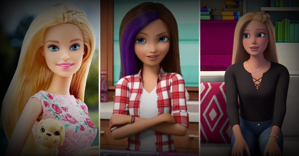
There have been plenty of animated Barbie releases over the years. And considering the huge success and popularity, in 2023, Mattel also produced a live-action movie.
This success was partly due to the Barbie doll being one of the first toys to rely heavily on television advertising to promote the product.
Related Read:
Conclusion: Barbie Logo Has Changed Over The Years!
The Barbie company has had over a half-dozen logos during its six decades as a toy manufacturer. The iconic Barbie logo, with its distinctive pink color and timeless script font, has become a global symbol and continues to inspire creativity and self-expression.
Whether you’re a designer, a marketer, or simply a Barbie enthusiast, start designing your iconic logo today!
FAQs
In 1959, Mattel introduced the first Barbie doll. The initial Barbie logo was a bright pink wordmark in a bespoke cursive design with letters slightly curved at the top.
Barbie picked vibrant pink as its hallmark color to appeal to female consumers. Their logo captures the spirit of innocence and playfulness by being matched with a font designed to look like a child’s handwriting.
Ruth Handler’s daughter Barbara and son Kenneth inspired the name Barbie. Barbie graduated from high school in the fictional town of Willows, Wisconsin.